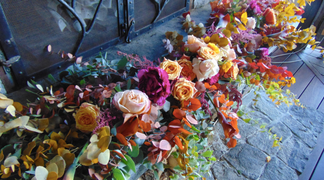
I wanted to start this post as an old-school letter like "Dear Pattern, we love you" since this is a love letter after all! But, then I didn't want to have to direct the whole post to the idea of pattern... I wanted to direct it to you all and share why we love prints and patterns so much. Plus, we've become really good at mixing them together to create beautiful and whimsical home decor looks. So, we  wanted to also share our thoughts on the best ways to mix prints and pattern together. Here we go!
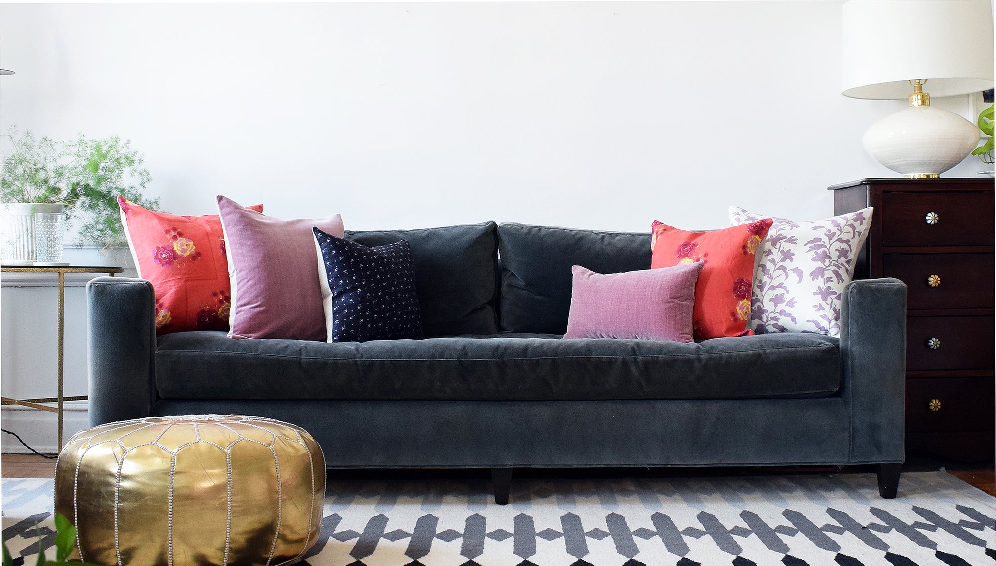
MIX YOUR SCALES
Having a lot of color and pattern in your home allows for it to feel both rich and inviting. But to truly show off your design skills, the key is to mix them successfully. To create that cheerful and dynamic look, you'll want to make sure your prints and patterns are different scales. The scale refers to size of the pattern - so when you mix scales, you will want to have a smaller, more compact pattern mixed with a larger scale pattern. If you have a print you currently have that you are trying to add to, select the opposite of what you have now to allow you to bring in more pattern without it being too busy or clashing. If you are starting from zero, you'll want to make sure your selection includes both scales.
 DIFFERENT PRINT STYLES
All of us here are drawn to so many different styles of prints and patterns - and that is great! You don't have to choose between stripes and florals, or geometric and plants and fauna. You can (and should!) bring in all different styles. In order to mix different styles of pattern, you'll want to first get a sense of how many pieces you're looking to include so you know what range of styles you'll want to target. If you're only looking to do 3 pillows or 2 pillows and a throw, you'll want to try for 2-3 different styles. But, if you're looking for 6 pillows and a throw, you'll want to mix only 3-4 styles because you won't want it to be too overwhelming. The more pieces with pattern you're mixing, the more you'll want to pair up and have some stripes, some floral, ex cetra and not one of each. Similarly, you don't want to mix only stripes or only florals - having the different styles is what creates a beautiful, curated look.
MIX TEXTURES
So this is where it can start to get tricky! Because, when you're mixing, you are now aware of bringing in different scales of patterns and different styles of patterns. And now we're telling you there is a third axis on which you need to differentiate: texture. Texture means different fabrics and accents, for example velvet, linen, embroidered, woven, etc. Anything that feels different than the other fabrics you are using. Adding diverse textures gives the space depth - making it feel very full and rich. Try bringing in a few different textures when pulling a space together; it will be sure to help marry the different prints and patterns as well as allow for a special and inviting look.
LEAVE QUIETER MOMENTS
With all that talk on the amazingness of pattern (which we still very much believe!), you will also need your quieter moments so that it all sits nicely. When  people worry about too much pattern, that only exists if you don't have a few soft, quiet moments to let the eye rest. A few examples of this are: with pillows, have a neutral or a solid pillow mixed in with the patterns and colors. Or, if you have a lot of pattern with your artwork, try keeping the walls white with some space around them. Or, if you have a patterned wallpaper and bright pillows, try going for a solid and neutral sofa to anchor the space. We always try to bring in a lot of pattern but, in order for it to mix well, you'll want to give it some space to shine.
Now let us know how you like to mix prints and patterns on Instagram at @collyersmansion ! And, I guess in true letter fashion, I'll say: Sincerely, Me!